

The poetics of dark skin.
Colors in Between presents the results of Raquel Rosildete's experimental study with color filters in theater lighting over diverse dark-toned skins.
The colors
on the skin


The proposal consists on the use of colors in a way that creates a watercolor on the stage, in which different tones are mixed to each other in the space and through the performers, denying homogeneity or whiteness. The idea here is to explore the topography of each individual, against the flattening of the “universal” being.


The project
Colors in between is a research in theater lighting that was born on the stage. It examines how to illuminate People of Color for theater and dance, and seeks to understand the representation of dark skin in theater. It faces the complexities of the performative bodies in dance and proposes a design in lighting that accommodates various bodies and skin tones into the understanding of performance, of subjects to be illuminated at the possible visual narratives on the stage. It will be an anti-racist ally on the technical side of the performing arts backstage.
When I first had many different performers with various dark skin tones on the stage I realized that I have always considered a “universal” being on the stage, with a bright skin tone. That is the basis of the racist thought: when we believe one type of skin is universal, the reference, we ignore the differences between people and the stories their skin has to tell. “Colors in Between,” is the answer to that thought. It is the proposition that every performer on stage should be looked at based on their uniqueness, establishing a procedure of testing each skin tone as the basic tool kit in every creative process in theater. The project started, and it persists, as an experiment of lighting for People of Color on the stage.
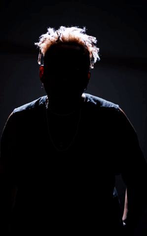
The first phase of the project experimented with different filter colors to test how the colorful light would interact with the skin. Using one color from one side and a distinct one from the other, the light forces a contrast on the body that white light cannot produce. In such a way, the texture, forms, and movements of the dark pigmented body are more noticeable on its spatial characteristics.
Colors in between intends to go beyond finding technical solutions to the “diasporic visualities”. It proposes a different way of exploring the interaction between light and skin. The black body changes the light when touched by it. As a designer and researcher, my challenge is to observe, document, and bring the discussion to the front of the stage and also to its back.


The author
Colors in Between was developed by Raquel Rosildete, a lighting designer for theater and architecture. With over a decade of experience in lighting, she works on the stage and in the space, continuously pursuing the narrative potential of visuality.
She has always been involved in research groups, studying light and its qualitative aspects. She understands the spatial experience as a phenomenon that can't be controlled but created within the space and its user.
As a Berlin-based artist, she has been involved with decolonial and anti-racist theater productions while developing a parallel work as an independent lighting designer for architecture.
She based her work in between elements. Composes lighting throughout visuality and narrative, architecture and theater, light perception and lighting habits, the colors within light and skin.
Credits
Performers:
Debby James
Gabrielle J. Von York
Cintia Rangel
Sandra Bello
Luana Madikera
-
Photography: Tuca Paoli
Graphic Design: Luisa Vieira
Website: Thais Lorenzini
Production: MIFRUSH Production (Micaela Trigo)
Photo location: Ackerstadt Palast
Research, Lighting: Raquel Rosildete
-
Video
Direction and Lighting Concept: Raquel Rosildete
Film maker: Tuca Paoli
Music: Sea Nova
Performers: Luana Madikera, Trvania, Arnold Toko
Music: Sea Nova
-
Contact: contact@raquelrosildete.com
The colors used in this project are from the Rosco catalog:
E201
E152
E136
E107
E116
E243
E058
E120
Funding:

Partners:

Supported by Fonds Darstellende Künste with funds from the Federal Government Commissioner for Culture and the Media within the program NEUSTART KULTUR.